Hi all,

I'm having a set of data as shown in the below table.

Stock count according to the type for each month

Currently, this data is showing in the lobby as below where it splits according to the type for each month.
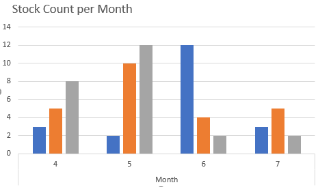
But, I actually want the y axis to be split according to the type for each month. In this example i’d want it to look like below.
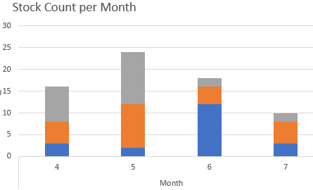
Is there any feasibility of getting a chart like above in IFS lobby? If so, any ideas on how we can do it?

Thanks,

Sachinthani.

Currently we don’t have support for stacked charts in the lobbies, but it would be a really nice addition. I had a look on the ‘IdeaWall’ which is where ideas like these are communicated to RnD, and I couldn’t find it, so I’ve taken the liberty of proposing this.


Thank you so much anmise !


Interested in this thread so I can follow if this does end up in the Lobbies functionality. I think It would be a really great feature.


I agree that stacked bar charts would be a great addition to Aurena lobbies. Given that this request was added to the ideas wall 2 years ago, it would be great if we could get an update on progress (if any).

Thanks in advance,

  • Robin

Hi ,

This is a functionality requested frequently by the end customers for ifsapps 10 product too. If ths could be facilitated would be a great plus point for the customers as well :)


Best Regards,

Sudheera Tharunie


Currently we don’t have support for stacked charts in the lobbies, but it would be a really nice addition. I had a look on the ‘IdeaWall’ which is where ideas like these are communicated to RnD, and I couldn’t find it, so I’ve taken the liberty of proposing this.

Would like to upvote the idea but could not find the link. Can someone please post the link ? Thanks!


Reply