Question

MWO layout difference between Classic and Service Applications

  • March 27, 2026
  • 1 reply
  • 16 views

Forum|alt.badge.img+12

Hello,

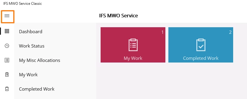
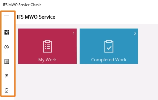
In MWO service classic application, when we click on the main menu as shown below, it adjusts the layout of the dashboard screens to the right and displays the main menu list. It also had the ability to display the icons for the users to view the list without clicking on the menu.

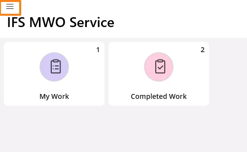
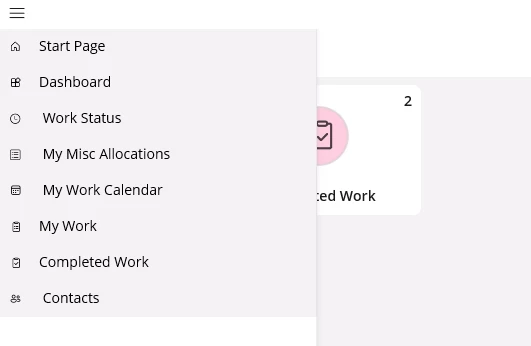
In the new MWO service application, the icons are not displayed directly in the screen and can be viewed only when the main menu is clicked. Also, the dashboard screen is not adjusted but the main menu overlaps with the screen as shown below. Please let me know if we will have the same layout features from the classic application mentioned above in the new MWO service application in the future updates.


1 reply

Forum|alt.badge.img+7

@Priyanka Cecilia V 

The behavior you are seeing in the new MWO Service application is intentional. This change was introduced to provide a consistent user experience across platforms, including Windows and mobile. As part of this alignment, the main menu in the Windows app now opens as an overlay rather than adjusting the dashboard layout, ensuring the same experience as on iOS and Android.

We do not intend to reintroduce the layout behavior from the Classic application, as the current design aligns with the intended long‑term UX direction for the new app.