Community,
I have been wondering if the Visualizer has been working properly for everyone that uses it.
I am on (IFS APPS 10 UPD 11).
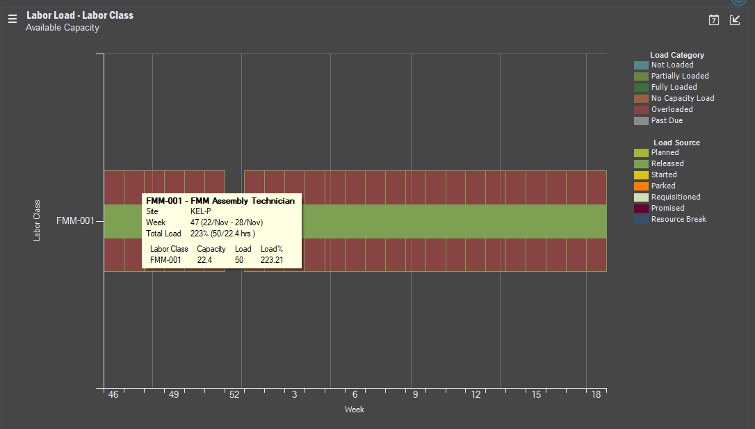
When grouping the Labor Class graph to a weekly view, it does not update the actual capacity in the tooltip, it still shows daily capacity which is misleading. (See picture)
In addition since it is a weekly view and aggregated, should it not also show that we are not overloaded if we look at capacity from a week by week standpoint?

Where as the Labor Load in Standard Hours - Labor Class shows this accurately.

Looking forward to some replies :).


