Hello!
A question about the redesign of page “Analysis Result” from APP9 (And APP10) to IFS Cloud. The question touches upon the same subject asked in this thread, but its not identical:
Analysis Results Overview (IFS Apps 10 UPD 14 Aurena) | IFS Community
The customer I am working with is upgrading from APP9 to IFS Cloud. In APP9 they are used to seeing the Result column, Inner/Outer Min and Inner/Outer Max in the same page as they Complete and Confirm the results. This is possible because the tab Variables is included in this page.
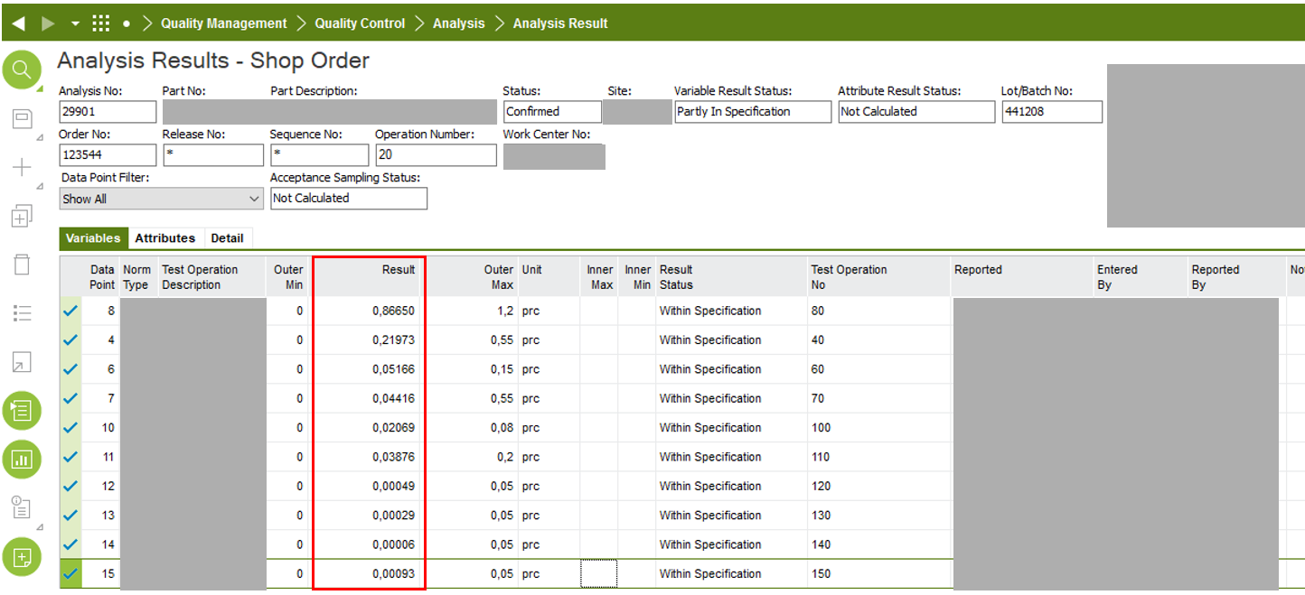
In IFS Cloud they cannot see these columns in Analysis result since that tab has been removed and moved to a separate page :
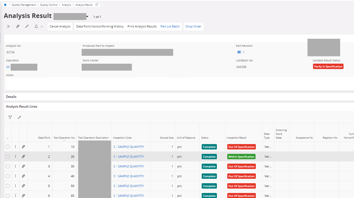
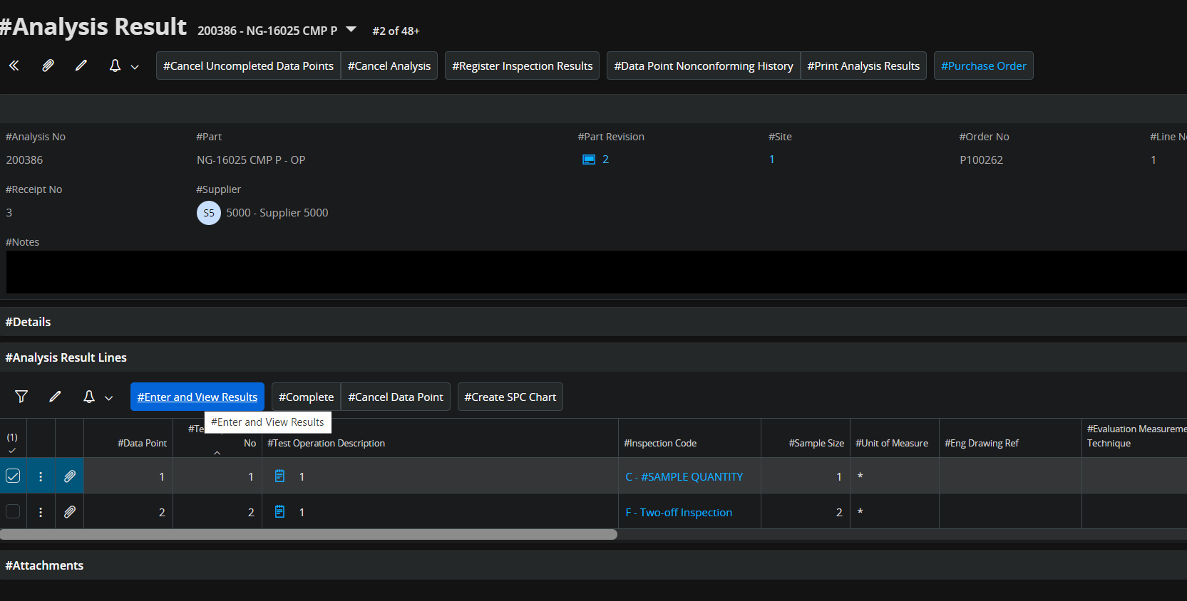
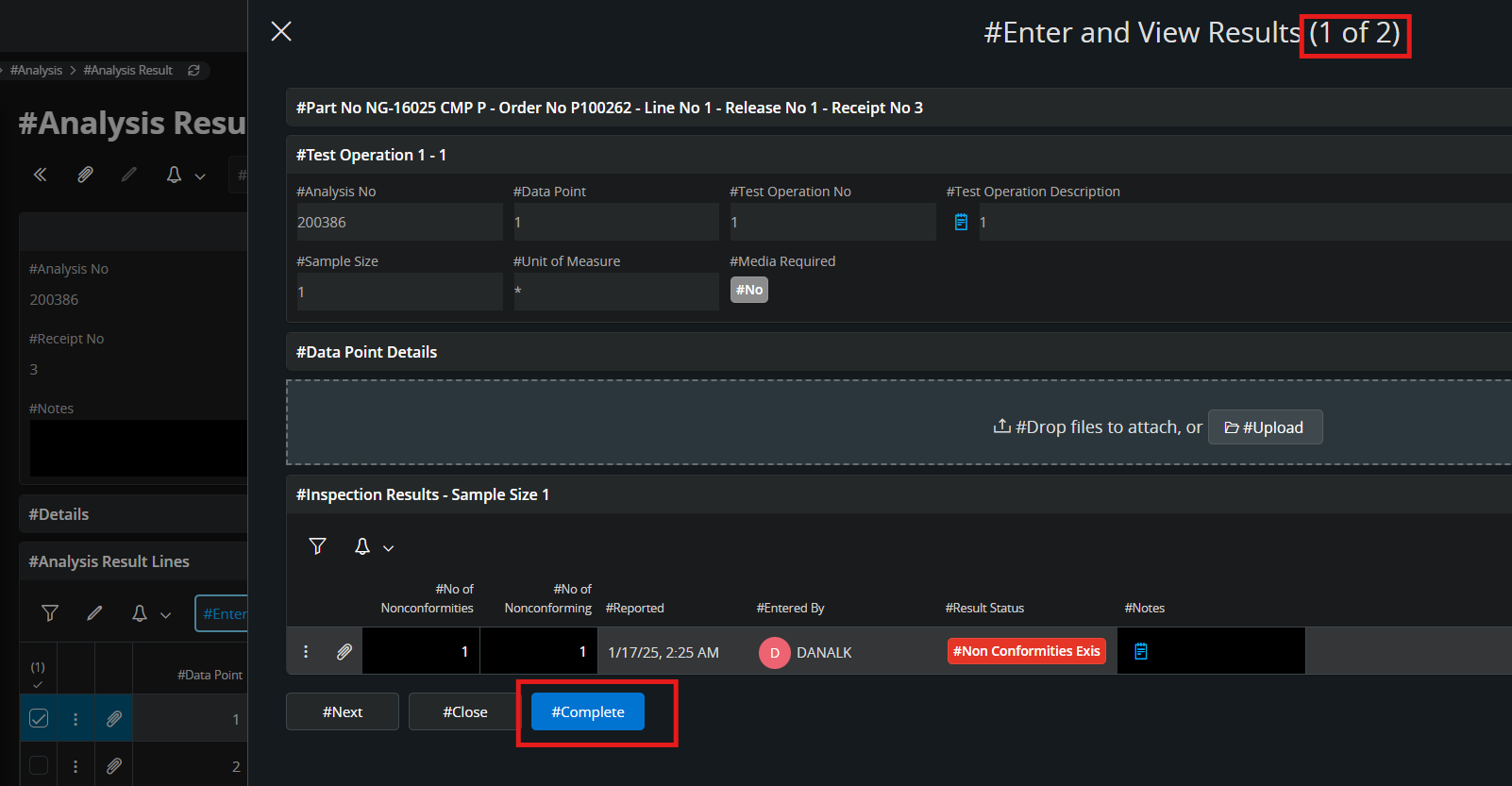
Instead they have to look here:

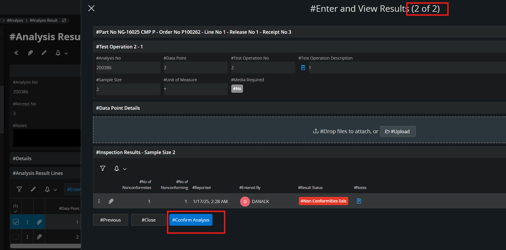
But from Analysis Results - Variables, where they actually see the result, they cannot complete or confirm the analysis. They can only do that from the Analysis Result page and from that page they cannot get an overview of the results that they are about to complete an confirm. So the problem is that they cannot see the result in the page where they must perform the confirmation.
Is the reason for this re-design a technical limitation, or why have you split the information from one page into two pages? A solution could be to work with two screens with the Analysis Results - Variables in one screen and the Analysis Result in one screen. It would still be great to get some background to this design change.
Thank you!
BR /Eva


