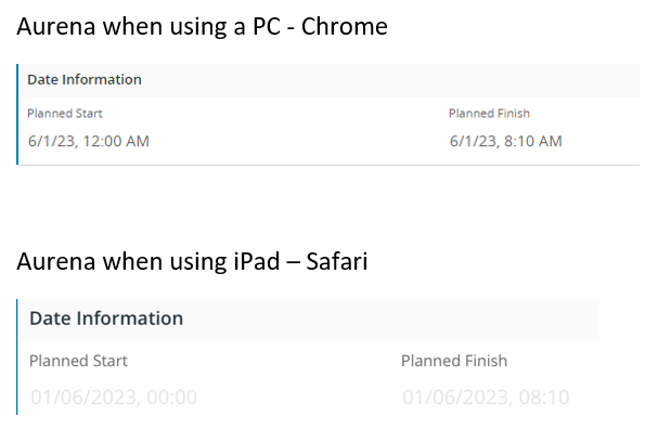
We are currently looking at deploying IFS APPS 10 Aurena client onto iPads. We have come across an issue with how Aurena is displayed in Safari on the iPad vs Chrome on the PC. The issue is with the contrast on read only fields.
As an example, here is data on Chrome (PC) and Safari (iPad)

This isnt anything to do with the display settings on the device itself. This is a problem as when you take the device outside into the light, you cannot see any data. The editable fields are generally OK and readable.
The other colour schemes also have this issue with a low contrasting colour for read only text.


