
Version: IRS Cloud 23R1

We have a couple of users that experience that the contrast between dark grey text and light grey background impairs visibility. The appearance designer does not allow changes to these colours.
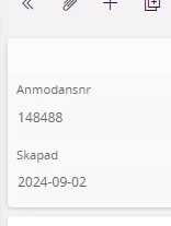
Example


  1. Can additional themes, besides the light and dark, be added and customized?
  2. Is there any other options for high visibility or better contrast that can be activated in IFS Cloud?

We receive this complaint from some end users as well and I was disappointed to see the theme “customizations” stop at the ribbon at the top and the side panel.  Yes we can brand the banner and the navigator, but it’s still quite difficullt to see the light color contrast. 

Many users converted to dark mode just because of the difficulty in seeing the light mode.  The only suggestions I can offer as a fellow IFS customer is to apply windows accessibility settings (which are pretty abbrasive) or adjust your monitor contrast and brightness.  
 

The choice of light-weight fonts in some areas of IFS Cloud surprises me.  The UI could use some improvements.  One should not have to change their monitor settings for an application.


Reply