It appears that with 21R2, there are only 5 Lobby Element background colors available (if you include white as a color), and 1 Accent color that can be defined in the Appearance Designer. Is this correct? While no colors could be user-defined in 21R1, there were 18 options provided, making it easy to group common lobby elements by color.

In the case of the pre-defined colors, white is a poor choice, and the other 4 are both commonly used indicator colors (red, yellow, green, etc.) and are such a low saturation as to make it difficult to see them against the default background color.

Am I missing the ability to change Lobby Element background colors elsewhere, or to add additional colors to the available palette?

If this is by design, what is the use case for this? 

@RobSimon 


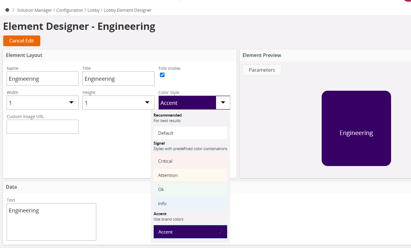
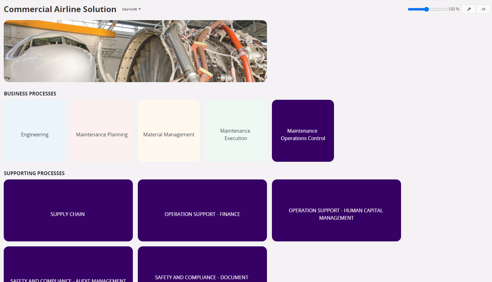
Some examples :

Available colors: only 1 accent color
Low saturation colors displayed


@Jan Romell @Wyomi Ranasinghe  any comments?


Hello,

This work has been based on extensive research with both customers, real end users and pre sales. 

I am happy to say that we actually base the changes on real research and input from users of both end user lobbies and people doing Lobby configurations. At the same time, realize a change like this may always take some getting used to - and as always with UX there are many opinions.

There are multiple reasons for the changes, but a few of them includes Theming support (Light and Dark) of Lobby and the introduction of Appearance Designer where we have the ability to “brand” the Aurena UX including Lobbies. This has been very well received, including feedback from 21R2 Pioneer customers.

Part of the change is also to set focus to the actual data in the lobbies. So not sure why you say White is a poor choice. You don’t say why.

We learned the readability (usability) was poor for some data visualization elements (charts etc) when sometimes configured using strong background colors.

When it comes to grouping, we’ve seen that grouping by colors can be difficult and unpredictable given responsive layout on different screen sizes, lobby elements removed by config or security, end user personalization through My elements, etc.

There is also the option to group by using Lobby Section dividers, although understand it is not always the best choice.

Although the option still remains to group by colors, but with a reduced color set, plus accent (or brand) color. 


I recommend the course User Experience - IFS Cloud 21R2 on IFS Academy (ref SOCLDONUE202109) to get some background to the design changes and also see the Appearance Designer in action.


Ping @Joyce  ​@Johan Jansson 


Thanks for the reply Jan, it’s good to understand how we came about design decisions. The branding capability in particular is going to be very valuable from a presales perspective, it’s a nice visual impact for prospects to easily see their branding on the solution. I’ve already spend a good amount of time with the Appearance Designer.

I do find it surprising that customers and the market were in favor of less color choices rather than more, and that low saturation colors were the solution to a chart reading issue. My screenshot above illustrates the low-saturation issue; imagine when I have to demonstrate that to a customer on-site using a projector with lower resolution.

As far as I can tell, there is no way to change the background color on lobby pages, so white as the background of a lobby element against a slightly-off-white background is less ideal even than the low-saturation colors. 

The pre-defined colors and saturation levels are also ones that are likely to be problematic for CVD, but that’s a much deeper discussion.

The Appearance Designer is an excellent tool, with a lot of possibilities. Hopefully it will be improved in future versions to give customers (and presales) more flexibility to take advantage of those possibilities.


Thanks for the feedback @Jeremy Green and a good answer @Jan Romell.

One thing that i can add is that it’s really difficult to please everyone in this case. And it’s part of a transition. We are trying to increase the overall experience, the accessibility, include themes and the possibility too ”brand”. This unfortunately will lead the some constraints.
One key insight was by giving the Lobby Designer (Witch often isn't a true designer) too much possibilities/different colors combinations the overall experience will get worse. This was one ideas behind the Styles dropdown in the lobby designer.


One thing that i can add is that it’s really difficult to please everyone in this case. And it’s part of a transition. We are trying to increase the overall experience, the accessibility, include themes and the possibility too ”brand”. This unfortunately will lead the some constraints.


Completely understood, and the branding capability will be particularly useful.

I’m still trying to understand the other color options though: white on an off-white background, and the extremely low saturation palette. Even on my own high-resolution, large-format monitors (dual 24-inch LED’s) the colors are barely discernable. Many of our customers are not so fortunate in the hardware they’re working with, nor are we in presales always going to have a high-end projector during customer demonstrations.

Am I just failing to find the option n the Appearance Designer where I can change the background color on the lobby page itself? 

Even a true accent color as the border of each lobby element would help them stand out, but I can’t find an option for that either.


Just to follow up on a point that Jeremy made regarding client demos.


I happened to be in the office today, so I opened a lobby with the full palette in one of our meeting rooms.  


I will note that the projector that I was running this on is a reasonably good one - the majority of client projectors that I’ve worked with provide less definition.


Something appears to have gone wrong with my attachment.


As I can’t edit it, I’ll try again.  


If you can’t see it, please drop me a line (@nathan.daniel@ifs.com).  However, you can see in the thumbnail that the top five cells are difficult to make out, especially compared to the lower purple cells.


Hi again. The transition from full color background to more low saturated is (as said before) part of a transition. The background colors has previous been used to separate or group lobby elements. We are trying to improve that need by using other techniques than colors. Colors has a stronger and more subtile purpose and should be used to increase information like Critical, Attention and that something is Ok. And by incorporate more then the expected colors will make it more difficult for the user to under stand then meaning of the color. 
If a lobby designer has the possibility to apply all colors we completely rely on Lobby designer skill to use them in a proper manner. 
But for 22R1 we have bumped up the contrast for the more low saturated colors. Hopefully this will solve the projektor issue for now. Until we release a more suiting techniques for separation or grouping of elements etc. 

Thanks for the feedback 👍


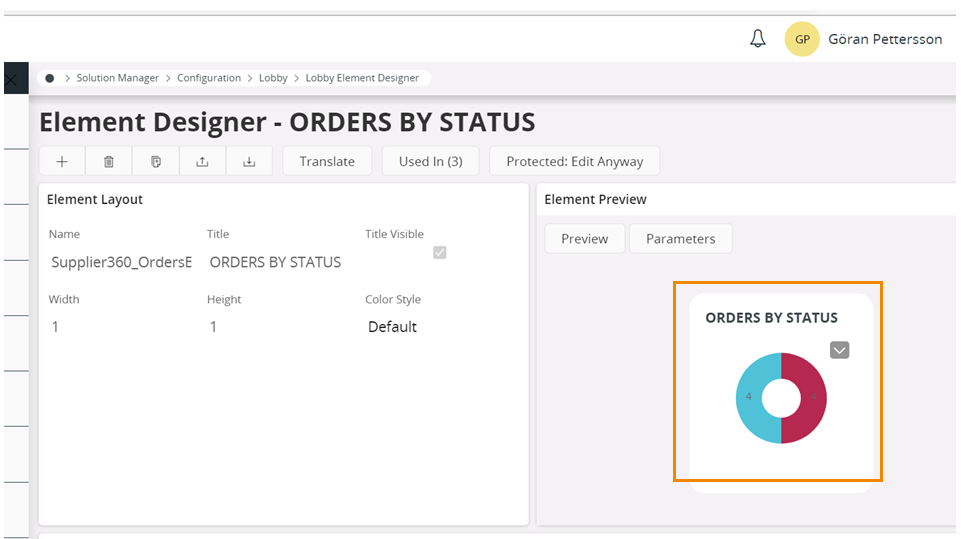
One effect of not being able to control colours in  lobby element

Element in supplier 360.

Shall it be possible to read the number in the pie?


Why not just give customers a full palette of colours and let them decide which ones they want to use? If it was possible previously then surely IFS could have ‘recommended’ colours and then all additional hex colours.

It is a bit like the conditional formatting that has just been introduced - one of the colours out of the limited colours is the exact same colour as the ‘link’ colour used by IFS, so when you highlight a cell/row in this blue colour you can’t see the text at all.