
")

Hi all,
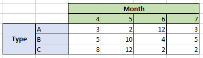
I'm having a set of data as shown in the below table.
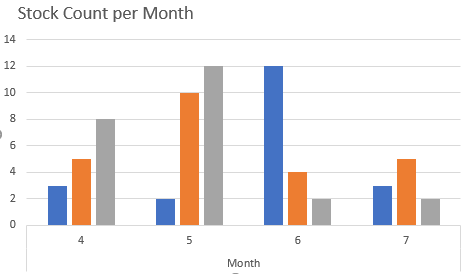
Currently, this data is showing in the lobby as below where it splits according to the type for each month.
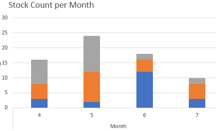
But, I actually want the y axis to be split according to the type for each month. In this example i’d want it to look like below.
Is there any feasibility of getting a chart like above in IFS lobby? If so, any ideas on how we can do it?
Thanks,
Sachinthani.
")
")
")
")

")