
Hi All
Can anybody advise me if below is the most optimized way this screen can be used? As you see, there's an unused space. Also 'reject and waiting buttons are hidden.
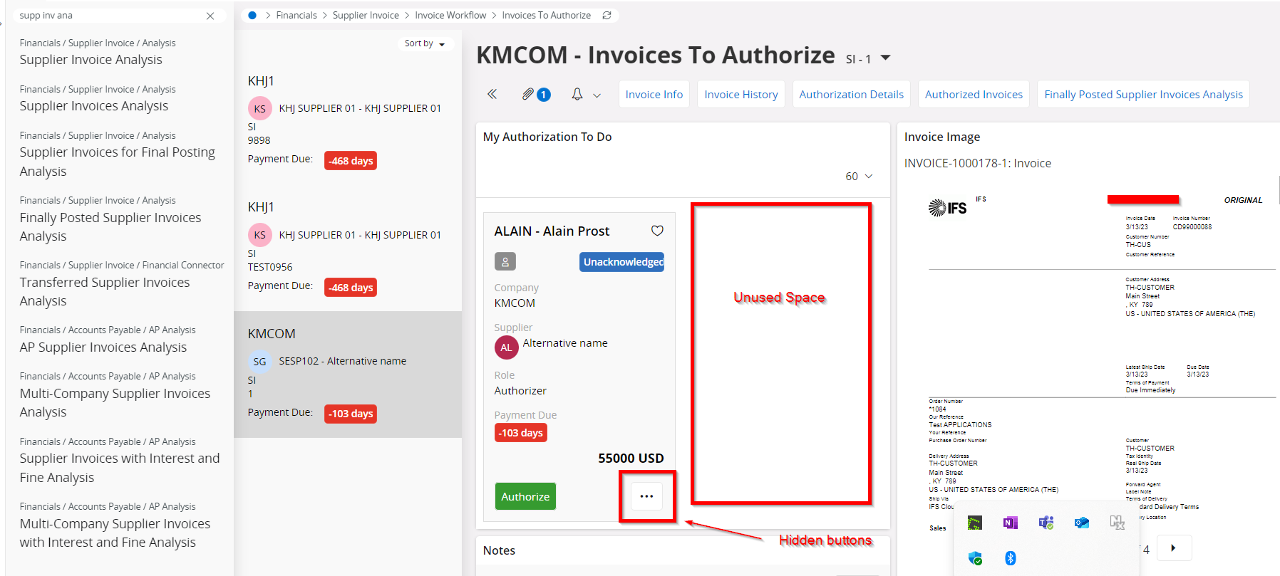
We are using 24R1 and I am keen to know if this looks better in the future versions. The above screen is from an IFS Ref environment since I cannot use a business sensitive screen in a public forum.