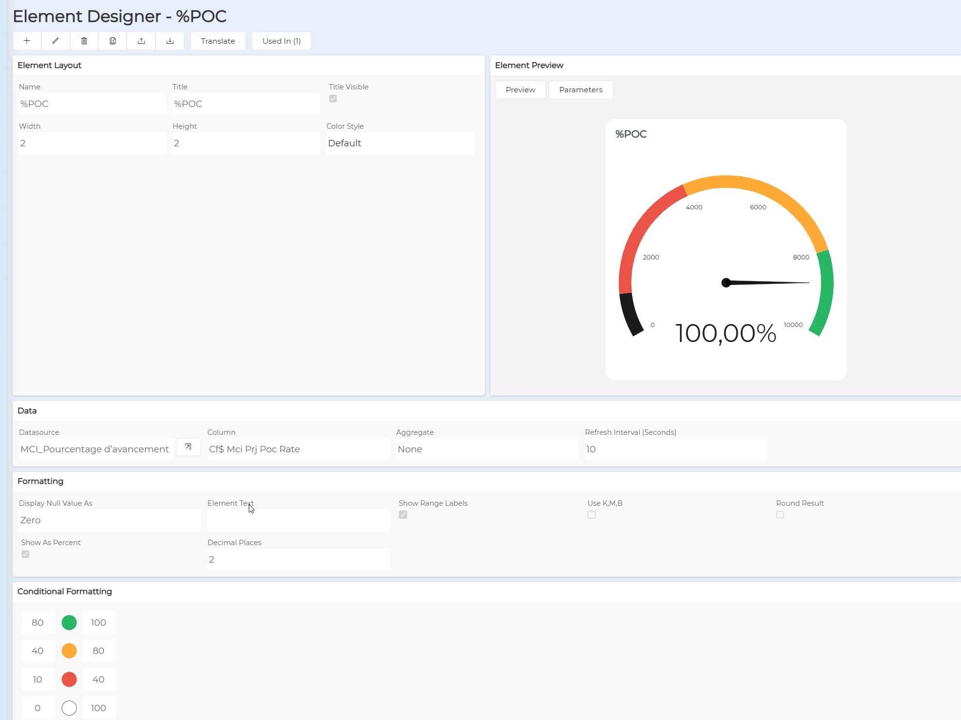

Hey everyone,
Has anyone else noticed any weird stuff with the Analogue gauge when one tries to choose the option “Show As Percent”?
I’m trying to visualize Closed Shop Orders divided by Planned Shop Orders, so this value is between 0 and 1.
The problem is that the gauge itself doesn’t show the percentage, but rather points to the right horizontally, and formatting doesn’t want to work either (colors take over itself randomly):
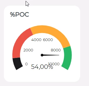
The datasource is selected from dual and is the following:
((SELECT COUNT(*) FROM &AO.SHOP_ORD WHERE objstate in ('Closed') AND TRUNC(EARLIEST_START_DATE) BETWEEN TRUNC(sysdate, 'mm') AND LAST_DAY(TRUNC(sysdate, 'mm')) AND contract LIKE NVL('$SITE$','%')))/(SELECT COUNT(*) FROM &AO.SHOP_ORD WHERE objstate NOT IN ('Cancelled') AND TRUNC(EARLIEST_START_DATE) BETWEEN TRUNC(sysdate, 'mm') AND LAST_DAY(TRUNC(sysdate, 'mm')) AND contract LIKE NVL('$SITE$','%'))
Maybe it’s not working because it’s a function, not a straight up number? But then what’s the point of the gauge?