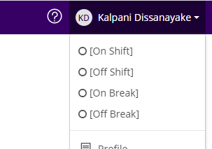
In Technician Portal, we want remove the global search, question mark icon and the list of status showing on clicking the name in the topmost of the page. Please find the image attached. 

Can anyone please suggest how we can remove the global search, question mark icon and the list of status showing on clicking the name in the topmost of the page using UI designer so that it reflects change only in technician portal?

Hi @TDCMOHAMMED,

In UI Designer there is a drop down at the top of the screen that defaults to smart/web client. If you change that to tech portal then the changes you make after will only occur for the tech portal.

That being said, I am not sure these items mentioned can be altered as they are part of the main banner. The question mark is system help so I believe that is hard coded.

The others you may be able to solve by denying access with roles or limiting what is viewed with access codes.

Kind regards,

Lee Pinchbeck


Hi @TDCMOHAMMED 

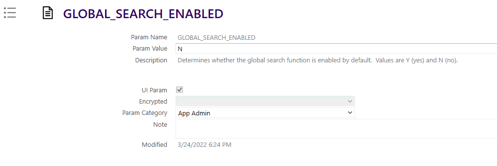
  1. To disable “Global Search” You can setup app param “GLOBAL_SEARCG_ENABLED”  to “N”. But it will disable the global search in other clients and portals as well. (Do a refresh cache full after changing the param value)
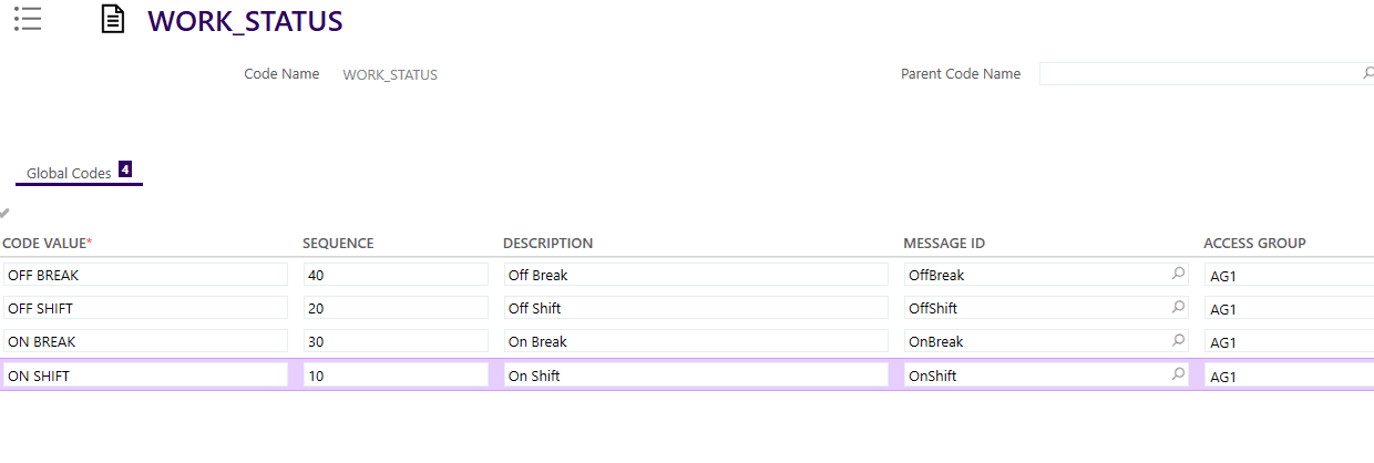
  1. To remove the work statuses, you may use access groups. You can go to global code > work_status and add an access group to each code value

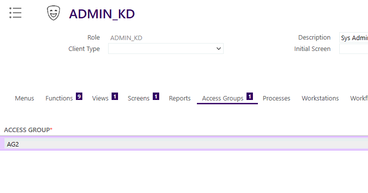
Then add a separate access group to your person role.

Then you will not be able to select any work status from the list in tech portal. But still the values are appearing inside square brackets (I am not sure whether it is possible to make the status fully invisible through a configuration)

  1. Regarding the question mark, I agree with @Lee Pinchbeck . Hope this may help.

Thanks @Kalpani Dissanayake  and @Lee Pinchbeck  for your advice but our need is as mentioned below :-

  1. We want to remove/invisible Global search ONLY from TECHNICIAN PORTAL and not from any other clients hence “GLOBAL_SEARCH_ENABLED”  to “N” is not fulfilling our requirement.
  1. ONLY in TECHNICIAN PORTAL work status should be fully invisible from the drop down list on clicking on name.
  2. If question mark is on main banner then could you please provide the name of the screen in UI designer.

Please suggest a way which meets our requirement.


Hi @TDCMOHAMMED,

The advice given details the current ways to get as close as possible to the requirements laid out. To meet them any closer would require change to the app itself.

I would suggest raising this in the Ideas section of Community to ask for this to be added in a later release.

Kind regards,

Lee Pinchbeck


Hi @TDCMOHAMMED 


In addition to the information provided, when it comes to your second requirement, you can disable the usage of work statuses using access groups. But they are visible inside the square brackets- to make them invisible, you may have to contact PD team.


hi @Kalpani Dissanayake


To disable the work statuses, in global code > work_status I have added access group called ‘dispatcher’ and in Technician role added access group called ‘technician’. In Technician Portal, work statuses are showing inside square bracket but when I am selecting any square bracket work status, it is updating the work status which should not happened as you specified

So assigning access group is not fulfilling our requirement. Could you please suggest a better way to disable the work status?


Hi @TDCMOHAMMED 


What is your FSM version? I have tested this in latest FSM version. Many thanks.


Kind Regards,

Kalpani.


We are using FSM version 6.9

--

Mohammed Mohsin Farookh


@TDCMOHAMMED 


I have suggested the available configuration in FSM to achieve your requirement. Since the access group assignment is not working fine, I suggest you to create a support ticket to report the issue to PD team - Disabling code value using access group still make code values to be visible inside square brackets.