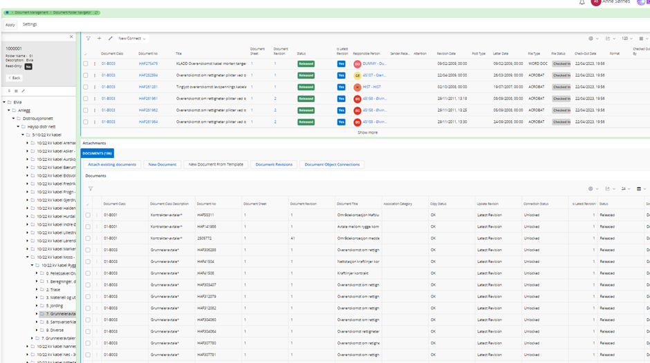
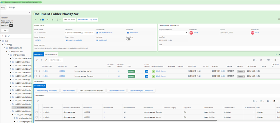
As of now in the Document Folder navigator, we don't have the direct visibility of the documents within the folders.

As a part of the new development, it is intended to bring the standard capabilities into the document folder navigator, so that the user will be able to:

  • Visualize documents within the folders directly within a document folder node.
  • Visualize the document details in the Document Folder Navigator page.
  • Drag and drop documents between document folder nodes in a structure.

We now have the 3 options in the poll below to display the Document details in the Document Folder Navigator page. Would like to know the preference. 

Thanks for the votes. If you have some time, we would appreciate also a comment on your thinking.


Hello Mathias,

I selected to Imbed the Details page.  I’m guessing somewhat as to what imbedding the Details page would look like.  Ideally, I think I’d like to be able to select a document and then have its details available on a page (a new tab?).  I’m interested in speed and the first option appears that it will be a little slower and present some unusual functionality.  The 3rd option would end up being another screen to deal with, another thing to train on, and another thing to explain not to mention the extra work in maintaining and programming it.  Without examples, that’s what I decided.

Thanks for explaining your thinking. When it comes to the performance, what we are talking about is the same cold/first start problem that we have in the Document Revision page. It IS the same page that we will embed. I personally think it's worth it though, and the problem (slow startup) happens for ONE user, and at most ONCE per day. And we have identified one command, Create Document Assistant that should, ideally, navigate back to the Document Folder Navigator once the document is created, but does not do so automatically (since it does not "know" it's embedded) I think it's a minor issue if the user needs to navigate back in that scenario compare to the great value of having every command and information there, without having to navigate.


Can I change my vote to option 1?

Any chance of seeing a mock-up of what you’re describing?


Embed. The cold start is a problem, but once it loads it’s not top of mind.  Is there a way to make it load in the background when the user starts for the day?  


Can I change my vote to option 1?

Any chance of seeing a mock-up of what you’re describing?

Open the Document Folder Navigator, then open the Document Revision page in a new web browser window. Then imagine the latter totally replacing the right hand side of the former 🙃 That's how it should look. Really.


Can I change my vote to option 1?

I think we can handle that by your comment 🙃


Embed. The cold start is a problem, but once it loads it’s not top of mind.  Is there a way to make it load in the background when the user starts for the day?  

The cold start problem consists of two sides: one is that it's a big page, and like other big pages it takes a few seconds for the client framework/runtime to render it, based on the metadata it reads from the server. But then there's another problem related to being able to connect a document to a large number of objects. For each object type, the client loads some metadata, at runtime. It's primarily a problem on the server as I understand it, and not easily solved. I think it needs to be solved though. But, it's also not as big of a problem as we think internally. It's enough that one user loads the page after the server has started, then it will be relatively quick for the rest…


Hi,

I voted for option 3 (embed Details page + some commands and navigation buttons).

I like the idea of having a lighter and maybe more user friendly page - but still with the most important information including object connections - combined with the most used (I guess) commands and navigation to Document Revision page. Speaking of which (navigation) I hope the framework soon will add the possibility to open pages from command buttons in a new tab or window :)

/Erik


A document revision page is a valuable tool in many contexts, such as project management, content creation, collaborative writing, and quality control. Here are some reasons why a document revision page can be considered the best:

  • A revision page provides a chronological record of changes made to a document over time. This makes it easy to track who made what changes and when, which is crucial for accountability and transparency.
  • By maintaining a revision history, you can identify and rectify errors, inconsistencies, or inaccuracies that may have been introduced during the editing process. This contributes to the overall quality of the final document.
  • A revision page serves as a historical reference point, allowing you to revert to earlier versions of a document if needed. This can be particularly important if you need to recover lost information or revert to a previous state.
  • When multiple people are collaborating on a document, a revision page reduces confusion and the potential for conflicts by providing a clear overview of changes. This can streamline communication and decision-making processes.
  • A revision page serves as an official record of changes made to a document, which can be important for auditing purposes, reporting, and archiving.

Hehe, hello, ChatGPT! :-p

Or? ….


A document revision page is a valuable tool in many contexts, such as project management, content creation, collaborative writing, and quality control. Here are some reasons why a document revision page can be considered the best:

  • A revision page provides a chronological record of changes made to a document over time. This makes it easy to track who made what changes and when, which is crucial for accountability and transparency.
  • By maintaining a revision history, you can identify and rectify errors, inconsistencies, or inaccuracies that may have been introduced during the editing process. This contributes to the overall quality of the final document.
  • A revision page serves as a historical reference point, allowing you to revert to earlier versions of a document if needed. This can be particularly important if you need to recover lost information or revert to a previous state.
  • When multiple people are collaborating on a document, a revision page reduces confusion and the potential for conflicts by providing a clear overview of changes. This can streamline communication and decision-making processes.
  • A revision page serves as an official record of changes made to a document, which can be important for auditing purposes, reporting, and archiving.

Not sure if that was arguments for option 1, but no doubt a Document Revision page (at least a good one, and I think the one in IFS is such) has all of those characteristics/feature/possibilities.
But, in the context of the Document Folder navigator I think we also have to put usability in as a parameter (nudge Mathias response :D).

And as long as we can navigate to the Document Revision page we get the best of both worlds, so I think I stick to option 3 🙂.

/Erik


"But it's so hard to click that button" ...


I like the idea of embedding one of the existing pages rather than creating a 3rd version.

Since putting documents into different folders is an administrator activity (?) make it the admin version of the page i.e. Document Revision


I like the idea of embedding one of the existing pages rather than creating a 3rd version.

Since putting documents into different folders is an administrator activity (?) make it the admin version of the page i.e. Document Revision

While I agree that organizing documents in various folder can be seen as a sort of admin activity, how about just browsing the folder navigator? That's for "normal" end users, right? I don't necessarily disagree with your vote though... 🙂 


right… so i was wondering do we need 2 doc folder navigators, an admin one and a browser one?


right… so i was wondering do we need 2 doc folder navigators, an admin one and a browser one?

No thanks 🙃 


Can you please clarify this a bit more?

  • Visualize documents within the folders directly within a document folder node.
  • Visualize the document details in the Document Folder Navigator page.
  • Drag and drop documents between document folder nodes in a structure.

Ad 1

Will you show a list of all documents inside the folder tree in new node? Will it be possible to collapse this node or have an option not to show this document node in the navigator?

Ad 2

Will you create a new tab to show document metadata for the selected document in the Document tab?

Ad 3

Will you make it possible to move the documents from one folder node to another folder node with drag and drop?


What we really need is a possibility to collapse the Document/All Documents block to easily use the Attachment panel.

Example:


If you have few documents, it is not a big problem, but when you have over 100 documents connected, it makes it less viewable and can be confusing.


@AddAnneaS 

Hi Anne, thanks for your comments.

Will you show a list of all documents inside the folder tree in new node?

Yes, once a folder node is expanded.

Will it be possible to collapse this node or have an option not to show this document node in the navigator?

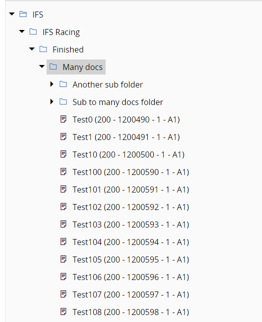
We discussed it but opted not to do it. When a folder is expanded, you will see its sub folders first, then all the documents. If the documents are many and it obscures the tree and make it hard to see the siblings to the expanded folder, or folders higher up, you can simply collapse the folder. Having an extra node to group the documents takes up space in the tree navigator and we think it's not needed.

Will you create a new tab to show document metadata for the selected document in the Document tab?

No. When a document is selected in the tree, the entire right hand side will show the Document Revision page.

Will you make it possible to move the documents from one folder node to another folder node with drag and drop?

Yes, inside the tree. You can drag and drop or cut and paste or copy and paste.

What we really need is a possibility to collapse the Document/All Documents block to easily use the Attachment panel.

Collapsing the contents of a tab is currently not possible to do in the client framework. If you want it, I suggest you create an idea in the Ideas section here on IFS Community.


Thanks for your answer.

So if a folder has both child folders and documents connected you cannot only see the folders?

We really don’t want to see the documents in the folder tree.

We have big folder structures and it can be over 100 documents connected to a folder in the structure.


You will see 25 documents. To see more you need to click More…

Regardless, can you explain the problem?


We don’t want to see documents in the Folder tree.

We have large folder structures and some nodes kan have over 100 documents connected.

We want the folder tree structure to be clean and clear and not disturbed by documents that make it unclear.


It's still a bit vague when it comes to what problems the user get from seeing the documents in the tree.

Here is how it can look when a folder with many documents is expanded. Here we can see the sub folders directly underneath:

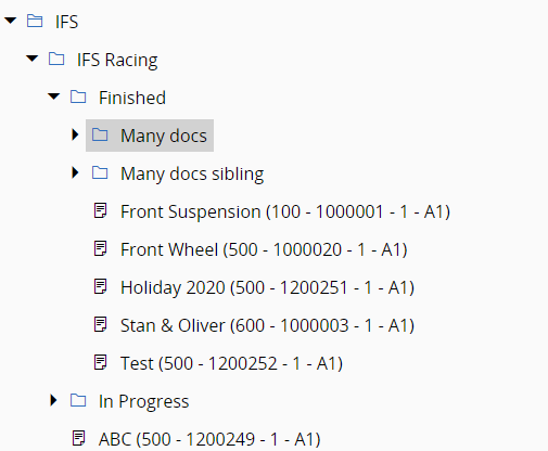
If we want to see sibling folders (folders on the same level) to "Many docs", we can collapse it:

If you can, I would like you to detail one or more scenarios where showing the documents in the tree creates a problem. “Clean and clear” says something, but it’s also vague and we don’t get a real understanding for what the user is trying to achieve.

What we do know is that we cannot “conveniently” (some think) move documents between folders, or copy and paste them from one folder to another, without displaying them in the tree.

We asked the customer that I suspect you are working for now if they wanted us to develop a cut and paste or copy and paste *without using the tree*, and their message to us what they wanted to do it *from the tree*.

It might be possible to have an option to control the display of documents in the tree, but I'm not sure if we can place it conveniently enough (we cannot have such a setting in the tree, as far as I know) for the user to toggle it on when they want to see documents in the tree and when they don't want to see them.

Thanks!


Ok, thanks for the examples.

It looks good that you can avoid seeing the documents in the folder tree structure. Your first answer when I asked if we could collapse - I misunderstood.

So ok 😊


Great, thanks for listening! 🙂

So, yes, the documents in a given folder will always be listed once it is “open” (expanded), but they will be hidden once that folder is collapsed, and any sub folder in that folder will be shown first, so that the documents in the folder does not "obscure the view."


Reply