Unnecessary White Space on Service Offering / Self-Service Portal
Hello everyone,
Is there a way to split the screen within a Service Offering / within assystNET (self-service portal)?
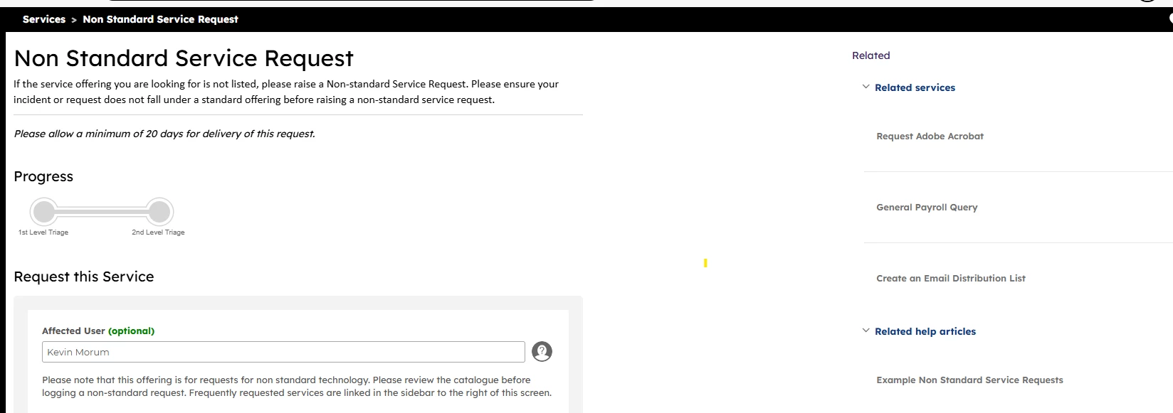
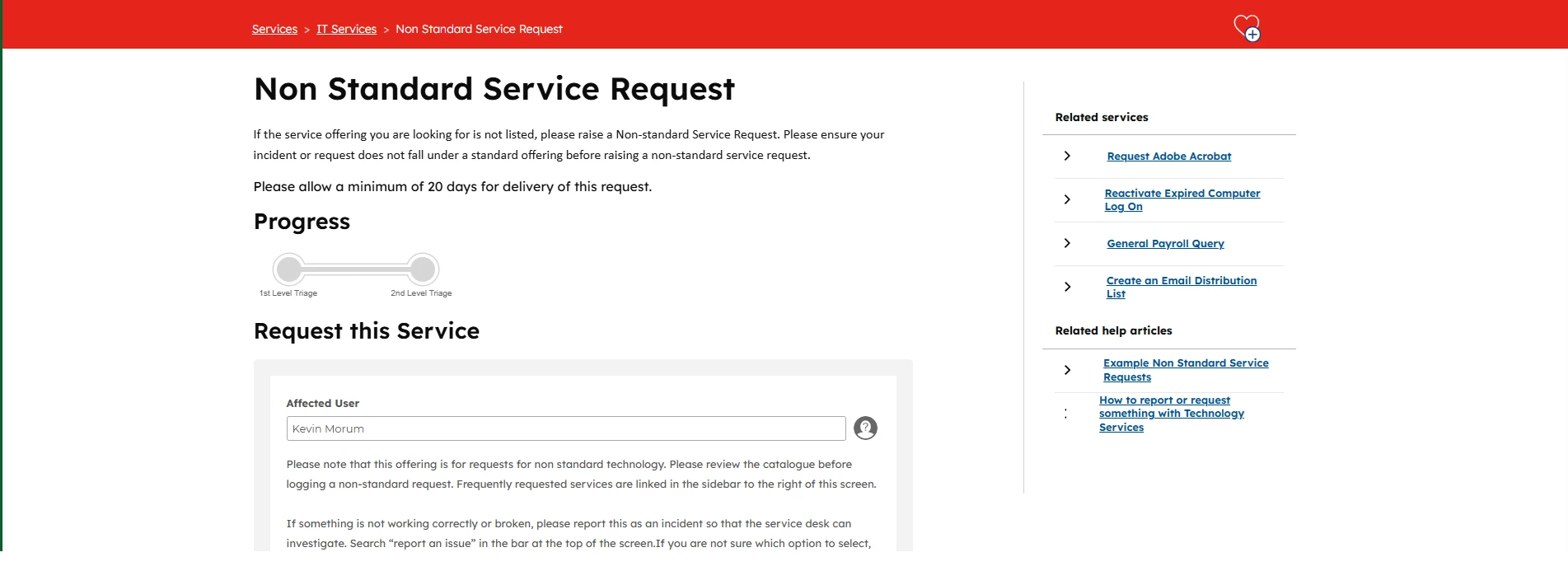
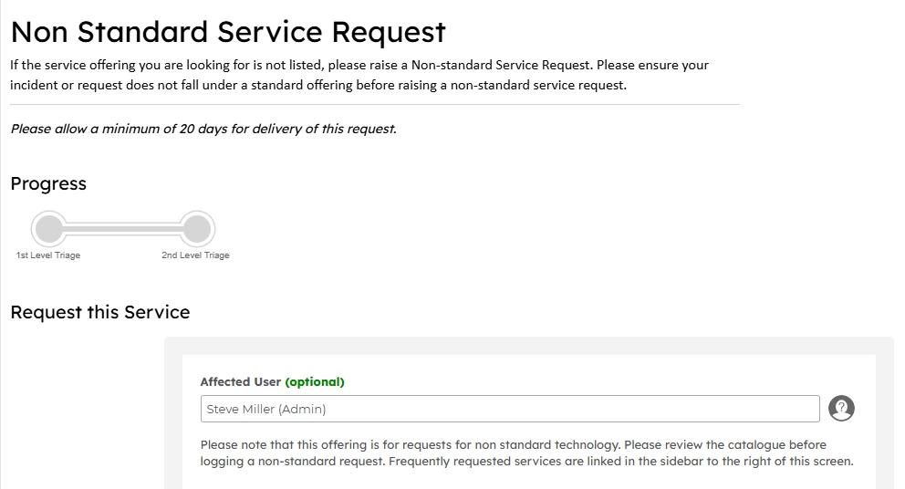
We have a ton of white space here which would be better if we could have a form on the left and the infomation to the right. Please see the screenshot below as an example?
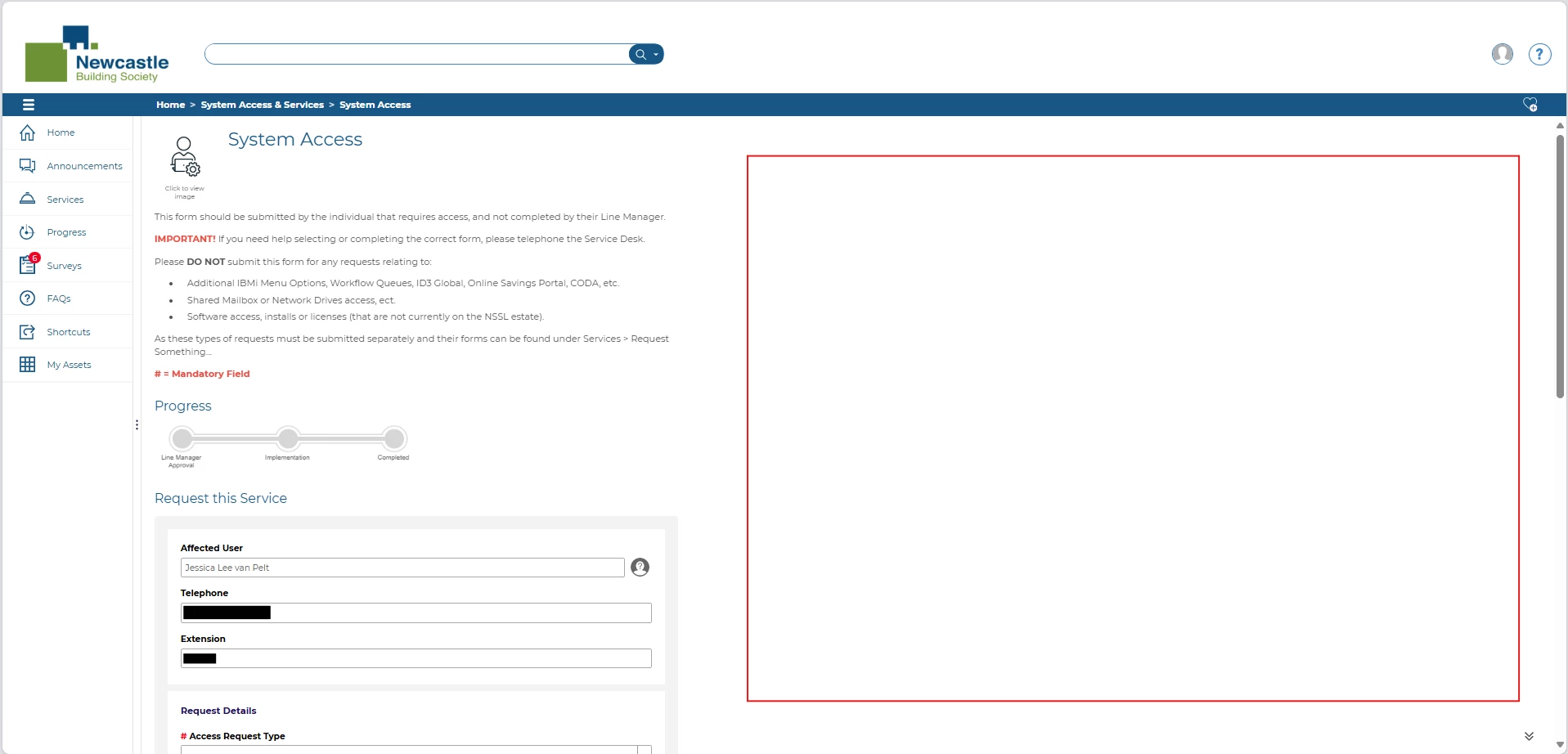
This would save our customers having to scroll down the page to get to the form.
Many Thanks,
Jessica Lee van Pelt (She/Her)
Service Analyst - IT Service Operations, Architecture & Design (NSSL)
Page 1 / 1
Hi Jessica,
That is a very extreme white space/dead space on the side.
You might be able to do something via CSS in your styles section.
This might be of some help (thank you @Steve Miller), though Steve has said - this isn’t specifically for the dead space, but just contains an example on how to use the media tag based on screen resolution/size.
That space would traditionally be filled with related articles (Knowledge base) or Related links, so if these are populated, you might find that space being filled.
What we have done, using CSS on our test system and following collaboration with our user research team who identified users not reading the periphery of windows, is set our test portal to look like this:
As you can see we’ve effectively split the whitespace/deadspace across both sides.
Using the thew following code you can shift your form details away from the left hand side a bit:
.tundra .axios-logging-form { margin: auto; }
which would give you something like the below:
If you want more info about our Test CSS style, feel free to reach out to me or Steve Miller.