

Hello,
I have created a lobby with several trackers and realised that the colour coding for the legend of the pie diagrams is not uniform.
The red colour always seems to be applied to the largest pie segment rather than the same category.
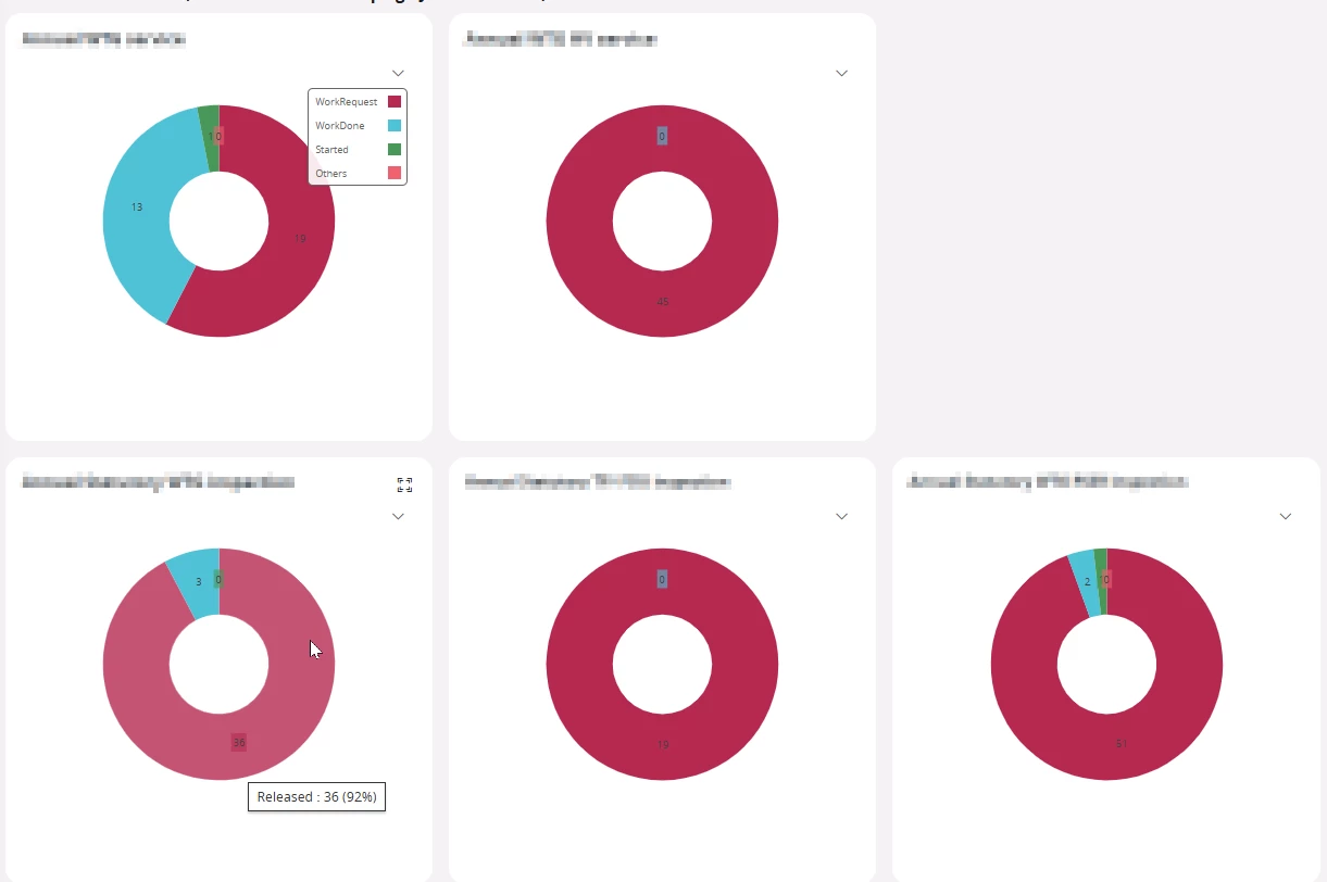
In the example screen-shot the red segment displays “WorkRequest” on the upper diagra and “Released” on the lower diagram. On the lower middle diagram the red segment is “UnderPreparation” on the lower right the red segment is “WorkDone”, which is very confusing for users looking at these diagrams.
Is there a way to set it up so “WorkReleased” (and all the other categories) is always the same colour in each diagram?
Thank you very much for your help!
