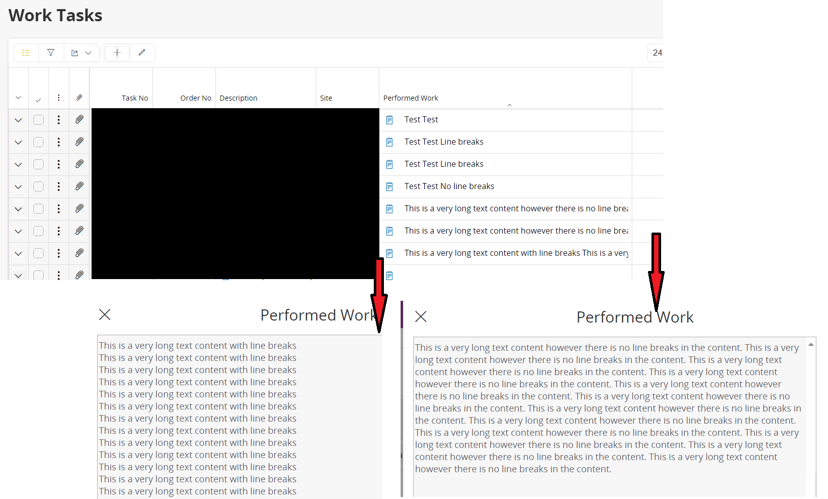
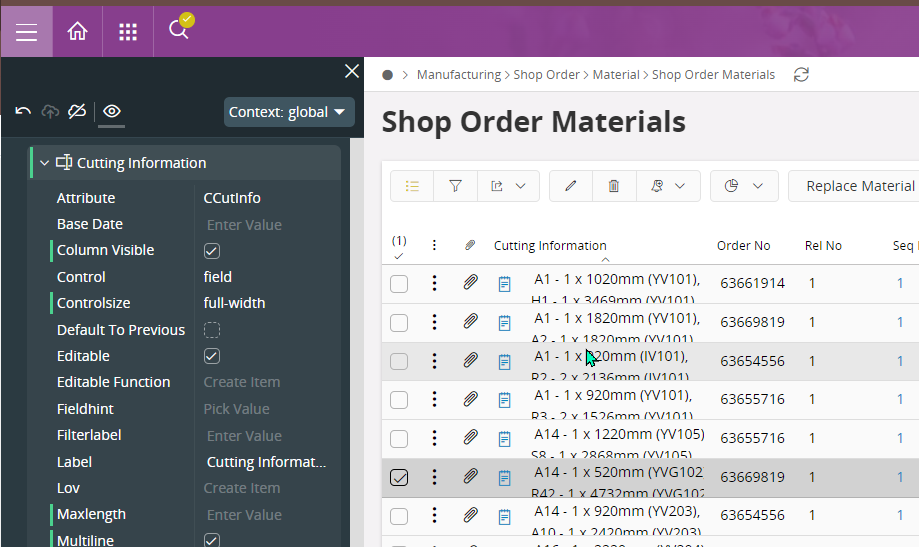
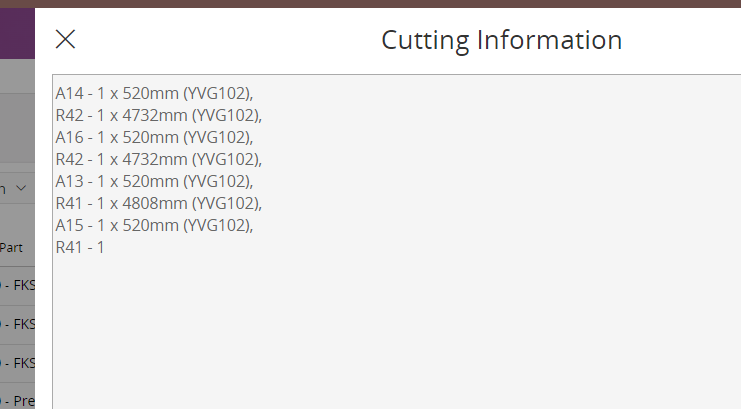
Received a case on the following from one of the customer. After the new UPD, they observed this change and inquired more info on that.

In overview tables, longer text are wrapped with the following approach in latest UPDs of App10 (ex: UPD 19, 20..)
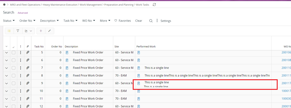
 

However in older UPDs (such as 8, 9), the approach is different. If it is multiline with line breaks or not, the appearance is same in the overview.
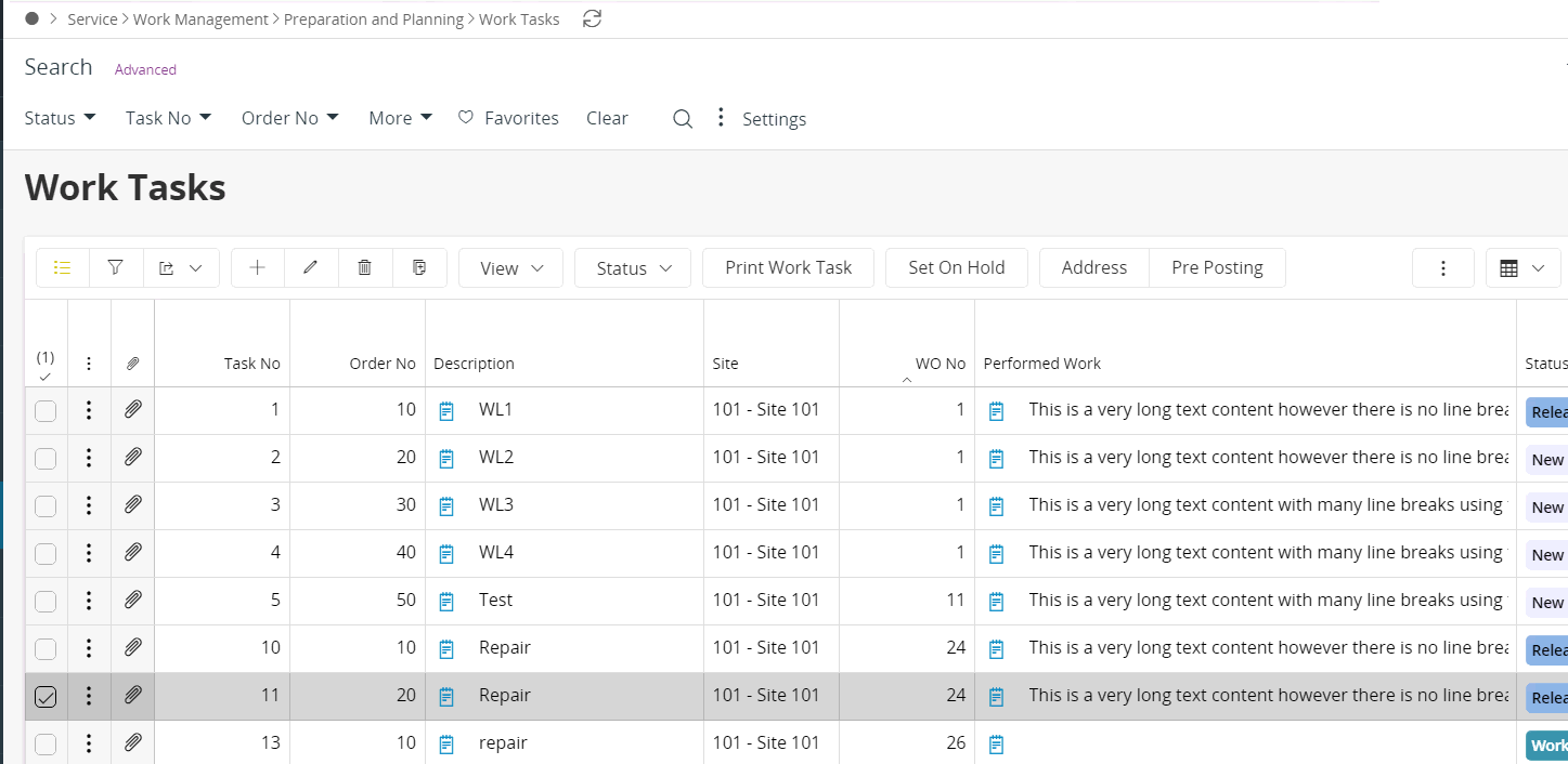
What is the design requirement behind this change and in which UPD version, this change was introduced?

It seems like this was introduced in UPD19

The UPD18 behavior is as follow


Hi @Buddhika Kurera

Have you had any more succes with this issue, we suffer the same after updating from UD16 to UPD20 in APPS10


BR Daniel


This is fixed in the following versions

APP10 - Through UPD24 (to be released on 24 June)
IFS Cloud - 24R1 GA (to be released on May 30th)

Fix: In IFS Cloud 24R1, the value would be displayed on ONE line in the field (any new lines are removed). To show the proper multiline formatting one can either hover over the field, or press the editor button. If the entire text doesn’t fit in the field, it’s indicated by ellipsis.

Jira Ticket - TEZAUFW-4350


Reply