IFS is very column dependant.  The record picker is pretty, but the drop down record selector works fine in most cases and does not consume page width.


It would be more useful to see 2 more columns on a page rather than the record picker each time the page loads for our business.


Here is a single record with the record picker all prominent with it’s single record.
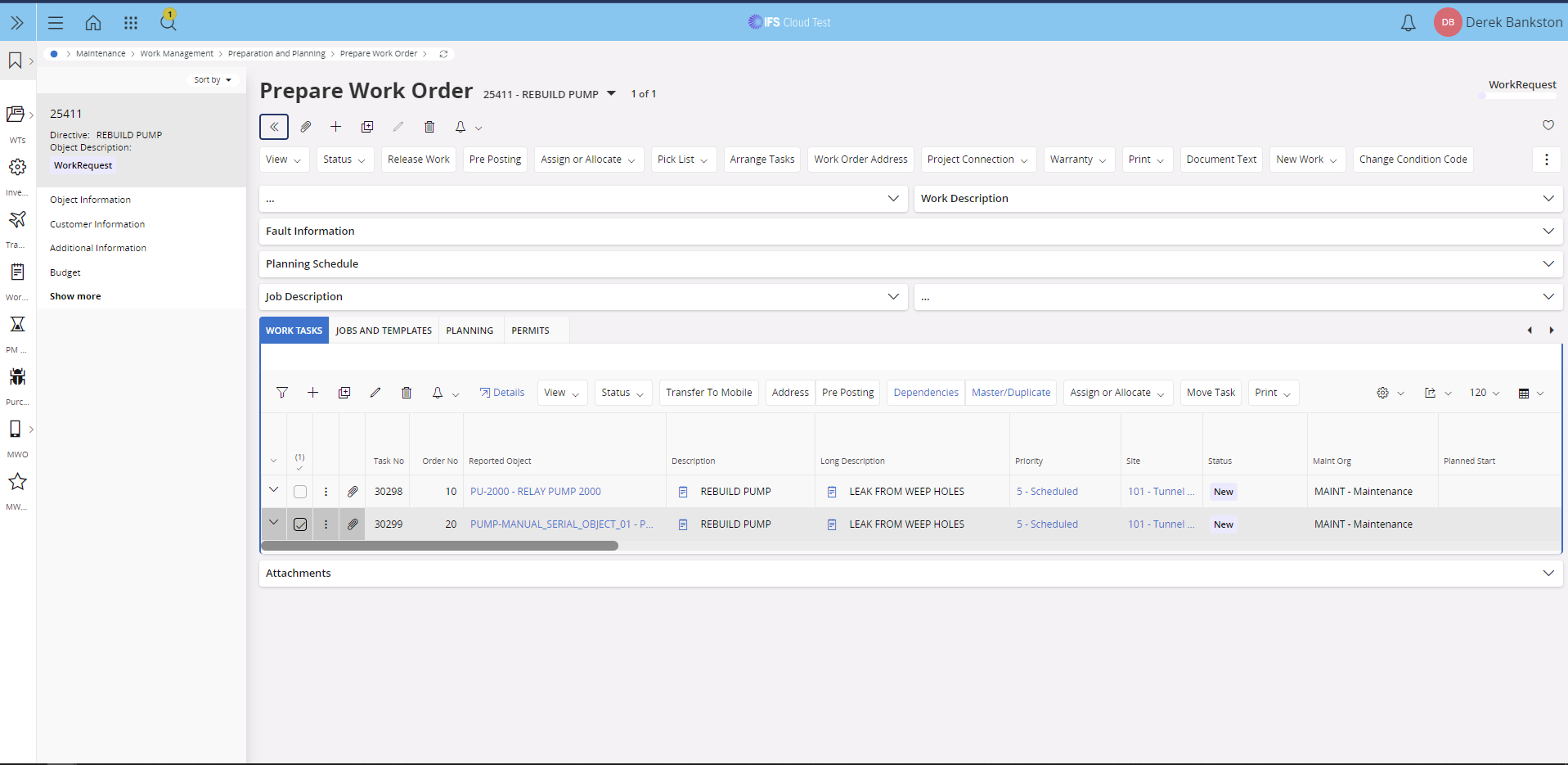
 

Record picker was previously hidden, but displays with a single record


It would be nice if it remembered that we want it hidden because we would rather see a couple additional columns.
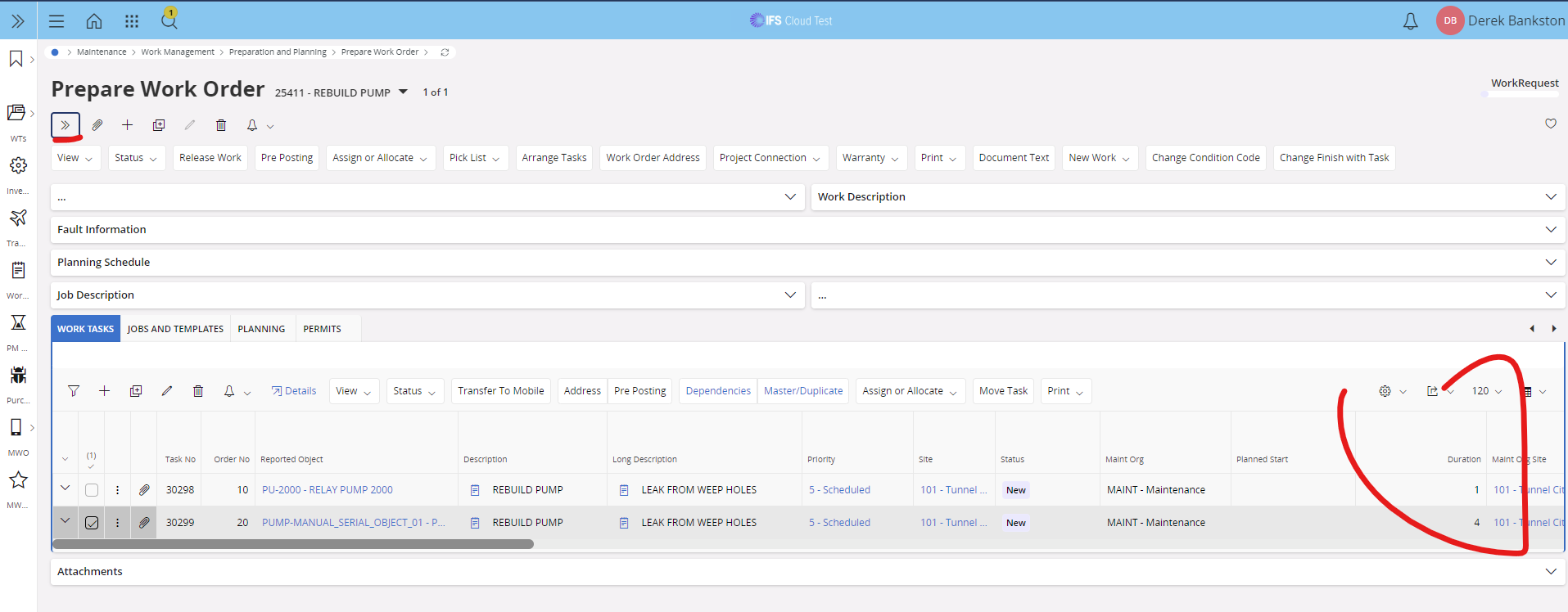
 

We’ll end up hiding the picker each time to avoid having to scroll to get a couple more columns

This thing works just fine if the picker stays hidden.
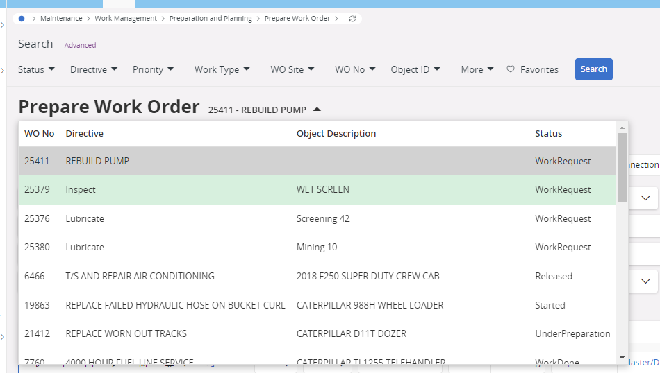
 

It would be nice if the picker wasn’t so proud of itself and could stay hidden.

I selected ‘Idea’ and it doesn’t seem like it worked?


If you wanted to create an idea I think you need to do it from this page: https://community.ifs.com/ideas

And, it should not be under Asset Management, rather client framework or user experience.

Thanks!


About your first screenshot there, the record picker acts also as the "picker" of some of the sub pages that was developed to support this screen. I don't know if that affects the behavior or not. Did you try in a screen/page that does not have sub pages?


We dislike the subpages and will be working to pull the information off them and put it on the main page so people don’t have to know where that information is hiding.


It is not guessable.  Hard to learn.  When an experienced user comes back to the system after some time off they are challenged with remembering where the information is.


PM No is a good one.  It’s not a link or zoomable now.  It’s on the additional information.


Tabs on the main page would be a lot nice than the sub pages.


@dbankston 

We dislike the subpages and will be working to pull the information off them and put it on the main page so people don’t have to know where that information is hiding.

I’m divided on the use of them. In a way, it’s either tabs or sub pages. Some use both, and to be honest IFS is not consistent in the use of it.

If you find a page which you think is hard to work with and the reason is the use of sub pages, I recommend you file an idea about IFS looking over the design. Feedback like this is very useful to us.


Reply