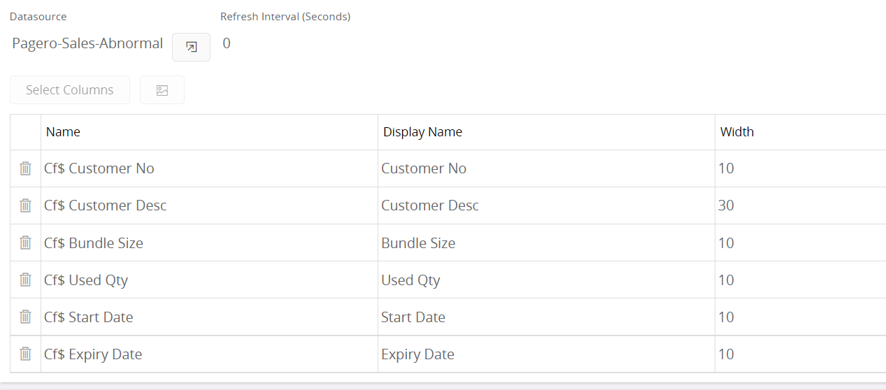
Here is a details of a lobby List I have created and the columns got too close than we expected .

Lobby element - 
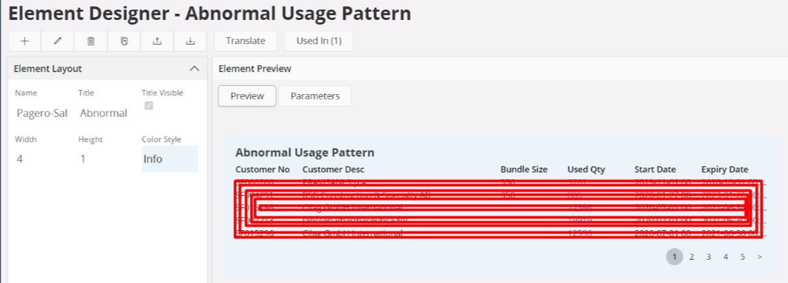
 

This is how it gets displayed in the lobby page. even though I changed the column width several times neither worked in the lobby page . It only worked inside the lobby element designer page
 

Inside lobby page


Is there a way to get properly displayed columns ?

Hi Chamaka - your post was exactly what I was looking for as I was about to post the same issue.

The issue stems from the fact that, for some reason, List-type lobby elements force numerical values to be right-justified, and text values to be left-justified.  So, when you mix these values on the same element and have a numerical column followed by a text column to the right, you get this display issue.


There are 2 issues that I would like someone from RnD to address here:

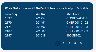
  1. The “Preview” section in the Element Designer shows all columns, regardless of numeric or text, as left-justified.  Why does this behave differently than the lobby page itself?  This negates the whole purpose of a “Preview” function if the results do not accurately reflect how it is displayed on the page.  Here is how one of my elements displays in the Element Designer - this looks great!:

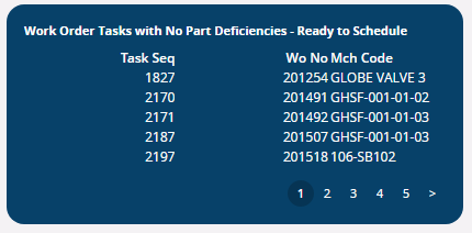
          Here is the same element from above as shown on the lobby page.  The Wo No and Mch Code columns are barely readable:
 

  1. Ideally, there should be an option within the Element Designer in the Data section where the columns are defined where a user could choose the alignment (left, right, possibly center).  If that is not possible and the alignment must be fixed, then please make it so that all values are aligned in the same way regardless of numeric or text (like the previewer).   

This presents a very frustrating experience for designing lobby elements & pages, and really needs to be addressed.
 

@AmyE @salawson222 


Reply