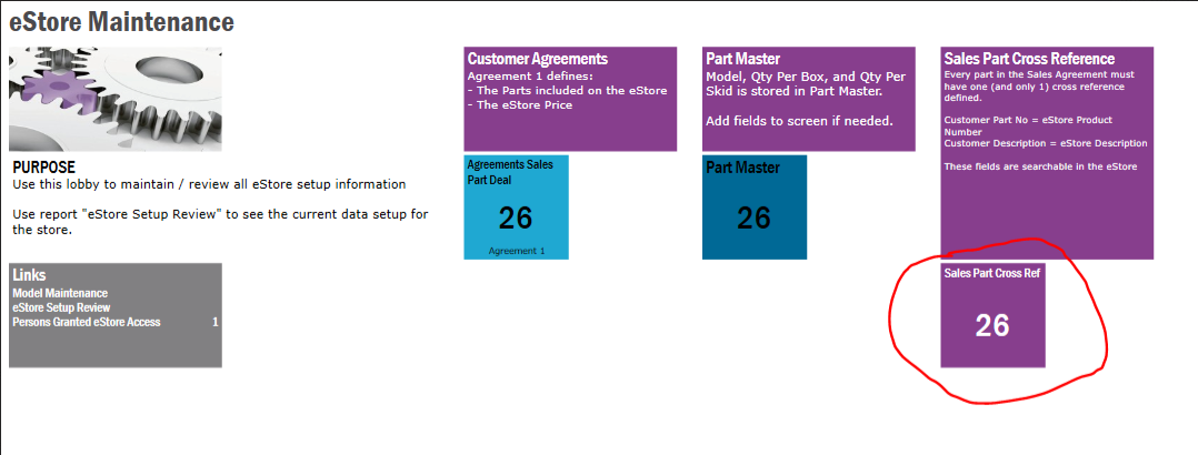
We are running IFS Apps10 UPD14 using IEE and we are trying to figure out how IFS determines if it will use horizontal vs. vertical dividers.  We have multiple people building lobbies and between us we are seeing 3 different behaviors.  When we add a divider, we don’t see any way to specific orientation, it just seems to pick on its own.

  1. Horizontal
    1. Edit mode - Adding a divider - creates a horizontal divider
    2. View - reflects horizontal dividers (matches what you see in designer)
  2. Vertical
    1. Edit mode - Adding a divider - creates a vertical divider
    2. View - reflects vertical dividers (matches what you see in designer)
  3. Mixed
    1. Edit mode - Adding a divider - creates a horizontal divider
    2. View - reflects vertical dividers (does match what you see in designer)

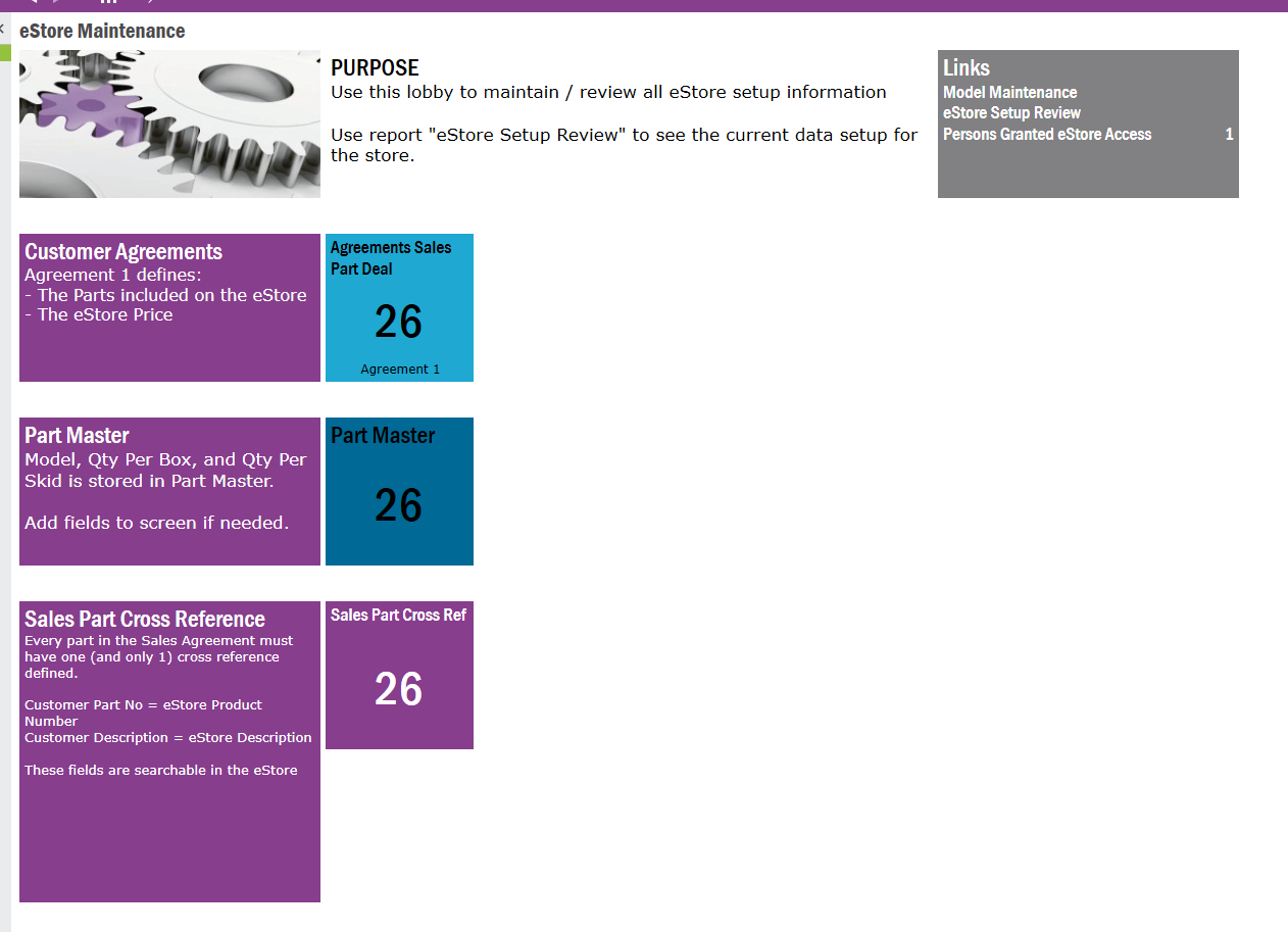
We are trying to make the published lobby look like what we see in the designer and we can’t figure out why the 3 of us are all seeing different behavior.  Is there a setting somewhere we are missing?  Here are screenshots of the vertical and mixed scenarios - for the same lobby (running the same version/design)
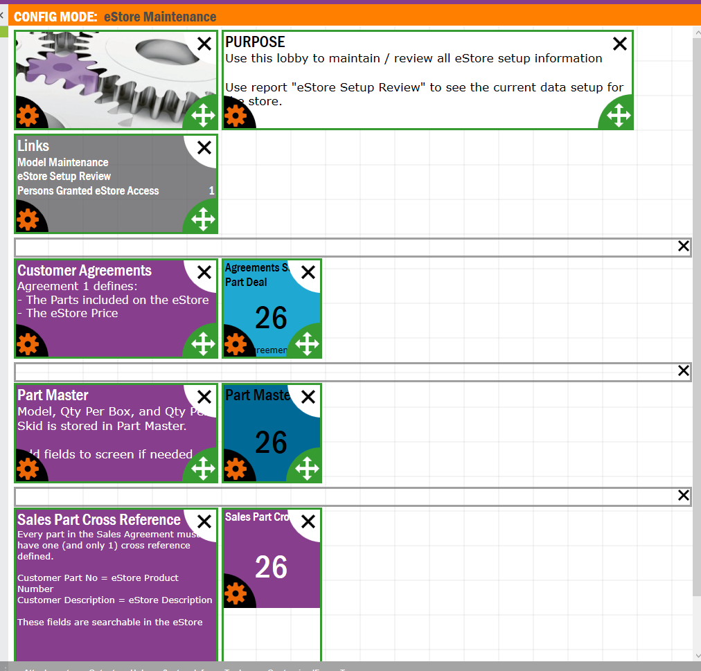
Edit mode


View matches horizontal divider
Same version of lobby - displaying a vertical divider organization


Check that the monitor size, screen resolution and lobby page percentage are all exactly the same between the three creators.  The scaling of the lobby page can affect the way it is rendered and it will dynamically shift the elements to shift in the space based on the resolution and the scaling percentage set on the page.


@ShawnBerk - thanks for the suggestion.  We tried it, but we are still seeing different results (some see horizontal, some see vertical).


@jhooperyan I thought this can't be helped as the end user is able to resize the size of the elements and next to this a lot of users may not have the same device as the lobby developer(s). My idea is that this is because this is the base for Aurena which is HTML5 driven and the settings of the end user define what the looks are (think of difference between using a tablet or a PC monitor of 27 Inch).


@eqbstal  - I know the HTML5 aspect means the layout is fluid, but I can’t figure out how IFS decides to interpret “divider” as vertical vs. horizontal and it really significantly impacts the organization of the lobby elements.  I run the screen on my laptop at 1920x1080 and 100% scale.  It’s this way when I’m attached to my external monitors at my desk, and when I’m connected to my travel monitor when I’m mobile.  And on my notebook monitor, IFS displays horizontal dividers when I’m at my desk and vertical dividers when I’m mobile.  Luckily - I’m one of the few users who runs at 100% scale and so far I’m the only one who has this problem of IFS flipping back and forth.


It's logical. The rule can be deduced from your three pictures alone....
Export the entire lobby page in full format and look at the xml. 
Test how elements behave when you move them between groups and you'll figure out how it works :-)


Reply