Hello FSM community,

we currently work on a survey set up, for our mobile device that consists of multiple surveys, to give the user more flexibility.
This setup works quite well, although we have a question to the visual presentation
in the mobile client when multiple surveys are used.
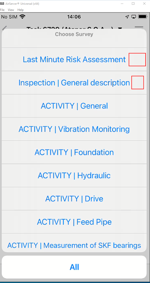


Navigating to “Survey”, a drop-down menu “Choose Survey” shows all different surveys that are linked to a task. Is this drop-down list editable?

The optimal scenario would be a visual indicator next to the survey name, when a survey is not finished. This indicator could be a symbol if a survey is not completed, or a number that indicates how many answers are still open.

If this drop-down list is not editable, a workaround would be to have a counter on a different screen, for example the technician review screen, that indicates how many surveys are finished and how many are still open.

Does anyone have experience with this topic?

with kind regards,
Michael Pieber

Hi @ATZMICHAEL 

The list itself is not editable.

Your second idea sounds feasible.

Any specific questions?

Cheers!


Hello @Shneor Cheshin,

@The list itself is not editable:

Thank you, i suspected as much.

@Any specific questions?

Is there a counter in the system, on how many “Surveys” there are in a Task? Alternatively, is there already field in the database that gets marked when a survey is completed?

If that would be the case it could be simply selected and synchronized to the mobile client.

with kind regards,

Michael


Hi @ATZMICHAEL 

I am not aware of any such fields to mark completed surveys. Or any counter field.

Not sure what you want to sync to mobile and why.

Could you elaborate?

Cheers!


Hi @ATZMICHAEL,


   Why are you not using linear survey approach and making all the questions required?

In this case one survey will finish it will automatically jump to next and required button will make sure all question is answered.


Thanks

Sumit Joshi


Hello @Shneor Cheshin and  @sujoin,

thanks for the replies.

@Shneor Cheshin: With “sync to mobile” i was referring to the counter or flag that marks a finished survey if such would have existed in the system.

@sujoin: Actually we used such a linear survey in the past. The big problem there was actually the mentioned linearity. Sometimes our users needed to skip a hundred questions before they came to the part that they actually wanted to document because their workflow is not linear. With this new modular setup of “multiple surveys” the users have a much easier time to actually work on the part they need at the moment. The only drawback is that there is no visual indicator to what was already answered. (As the original problem of the post explained)


Reply