Dear R&D,
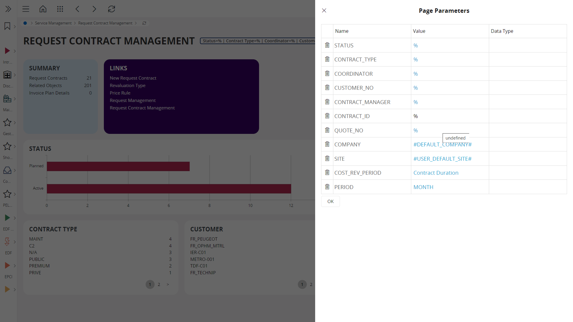
Since 24R1, filtering options on lobbies look like this. In the former releases, this was reserved to page parameters configuration hopefully. This is so ugly with data types displayed I’m sure this is not intentional. Could you confirm, and if so, I’ll create a support ticket right away ?

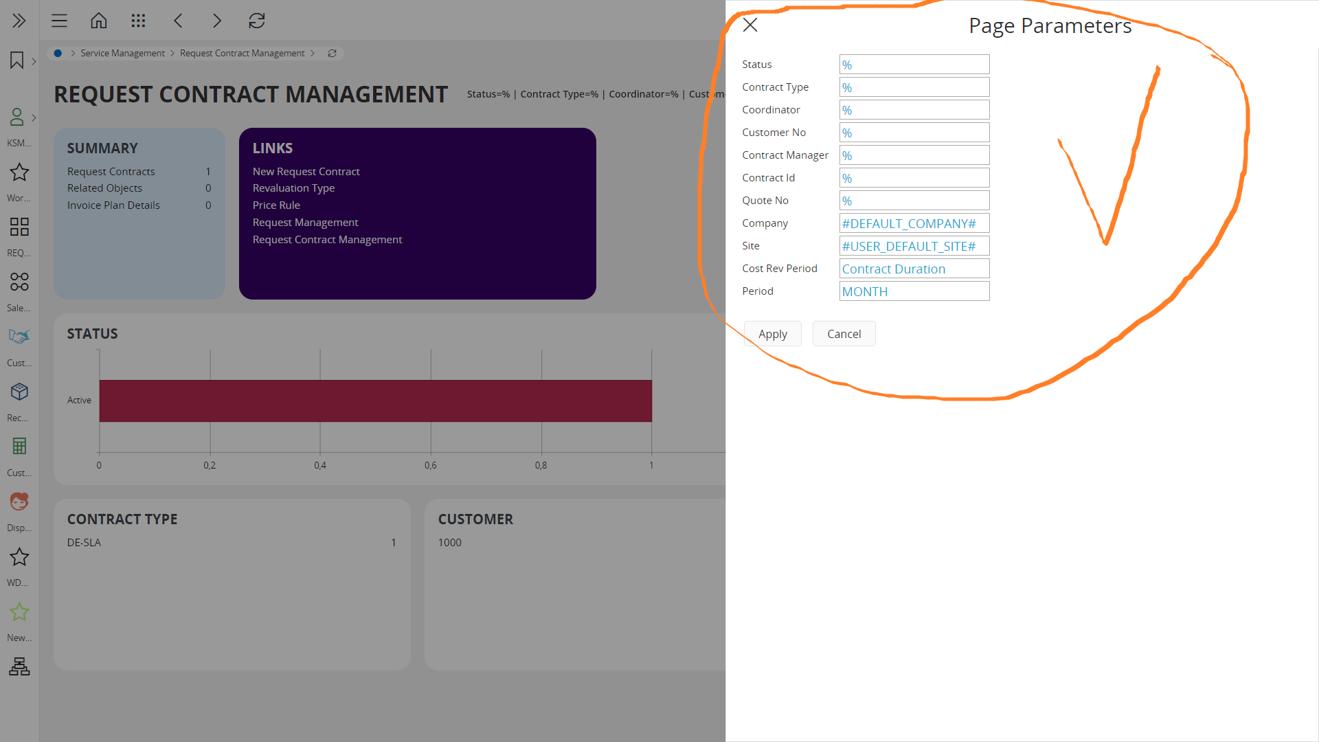
In the recent past, we used to see this :


