
")

Hello,
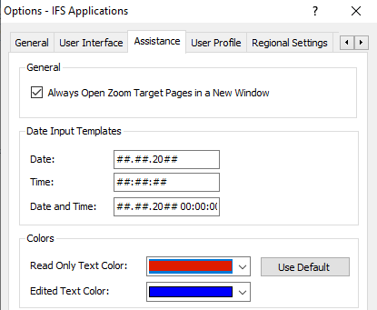
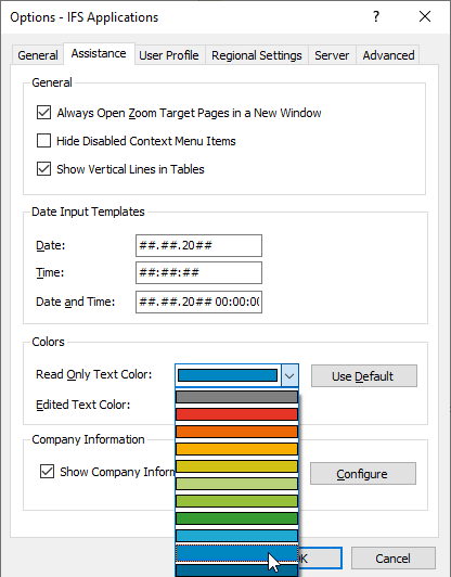
Our users are complaining about the reduced contrast due to available text color.
In IFS 8, our users are used to a luminous, strong red for editable text and a luminous, strong blue for non-editable text. Comparing the available sallow colors, this results in a lot less contrast in IFS 10 screens.
Is there any possibility to change the coloring themes of available colours to some more luminous colors to improve contrast.
I know, there is a Graphite or High Contrast theme, but that is though to get used to.
Thanks
Johannes
")
